Is Your Website Mobile-Friendly?
What does “mobile-friendly” mean?
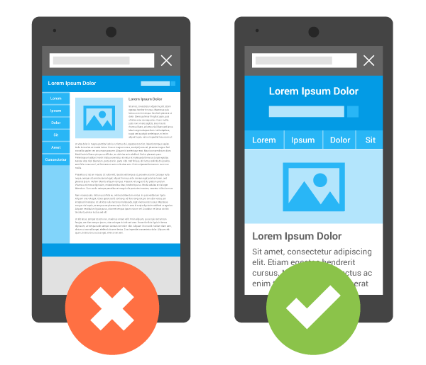 Your website is mobile-friendly when it is optimized for mobile devices. In order to be mobile-friendly by Google’s standards, your website should have:
- Text that is easy to read without pinching or zooming.
- Links or buttons that are large and defined so they are easy to select with your fingers.
- The correct code to tell the browser that the website is mobile-friendly.
Why does your website need to be mobile-friendly?
To learn why your website needs to be mobile-friendly, you must first know more about Google and their search engine. Google’s mission is to provide the most relevant content based on the user’s search criteria. For example, if you searched on Google for “movie theatres in Toronto”, you would want to see results for movie theatres and specifically a list of theatres located in Toronto.
Google has started to realize that relevancy is tied directly to a user’s experience on your website. If a user searched for “movie theatres in Toronto” on their mobile device and had to pinch or zoom to see the content they are looking for, then they are not finding the correct content as efficiently and quickly as possible.
As of 2016, a report came out saying that approximately 58% of online searches in the USA were done on mobile devices. Google has recognized this trend and so they want to list results that provide the best relevant, user-friendly content.
For this reason, Google has started to penalize website’s that aren’t mobile-friendly in the mobile search results. If your website is not mobile-friendly, you risk not being shown above your competitor in mobile search results.
How do I know if my website is mobile-friendly?
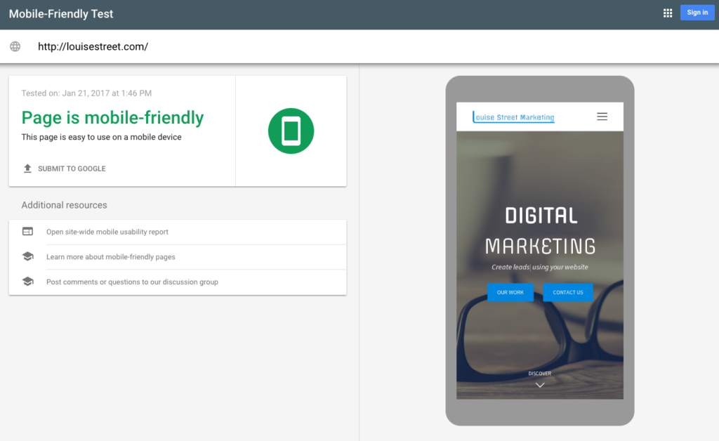
Google has provided a very useful tool called the Mobile Friendly Test in the Google Search Console. You can simply input your website URL into the Mobile Friendly Test and Google will analyze your website to determine if it is mobile-friendly. Once analyzed, the test will provide a report as seen below:
How can I make my website mobile-friendly?
 If your website is not mobile-friendly, you will need to consult a web developer to modify your website’s code. Your web developer needs to reorganize the website into a format that will perform well on mobile devices.
The developers at Louise Street Marketing would be happy to take a look at your website and provide a quote on converting your website to a mobile-friendly framework. In fact, we take this a step further and modify the code to be responsive. Responsive development means that your website will be optimized not only for a desktop computer and a mobile device, but every device width available from smart TV’s to tablets. This is the recommended method of development by Google.
Contact us today to get started converting your website to be mobile-friendly!